| This chapter introduces instruments, with which we can clearly illustrate, how often the values of a variable occur in a data set, respectively how the data are distributed. |

|
|
Educational objectives
In this chapter you will get introduced to important means of data visualisation like the bar chart, the histogram and the scatter plot. After having worked through this chapter you will know which illustration method to choose for which type of data and you will be able to interpret these graphical representations.} Key words: frequency table, absolute frequency, relative frequency, bar chart, pie chart, histogram, empirical distribution function , boxplot, scatter plot). Previous knowledge: variable, type of variable, value |
Central questions: How can data be represented and illustrated in a clear way? Which illustration methods are adequate for each particular data type?
The data set of Dr. Frank N. Stein includes the data of \(121\) chemical company employees. To overlook and process these data, he has to illustrate them in a meaningful way. But how?
If he shows a table with numerical values of individual patients at a presentation, neither he himself nor the audience will understand the content of these numbers.
This is why the data should be summarised in a frequency table or illustrated in a figure. With a figure one can understand important characteristics of the data at a glance. For instance, we can see right away in which range the data lie.
Of course it is important to find an adequate illustration for the data at hand. You will learn about this in the following sections.
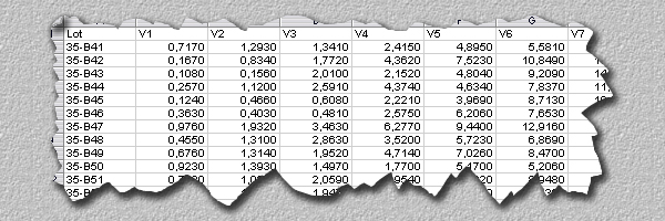
In the patient file, the patients' gender was recorded with the values \(1\)="male" and \(2\)="female". We would now like to know the number of women and men among the chemical company employees attended by Dr. Frank N. Stein. To do so, we count how often each value or category appears. The two resulting numbers, also called "absolute frequencies", are represented in a table.
Discrete variables, which do not have too many values, can be illustrated in an easy and compact way like this. First of all the absolute frequencies of the different values have to be determined. Then we can also calculate the so-called "relative frequencies". We get these by dividing the absolute frequencies by the sample size. The sum of relative frequencies of all values is therefore always \(1\). Relative frequencies are often also expressed as percentages. For this, we have to multiply the original values of the relative frequencies by \(100\). For instance, a relative frequency of \(0.2\) corresponds to \(20\%\). Another important term to be introduced is the "frequency distribution" of a variable.
|
Definition 2.1
The pattern of relative frequencies of a variable is referred to as frequency distribution. |
For Dr. Frank N. Stein's sample, the frequency table of the variable gender looks as follows:
| Category | Absolute frequency | Relative frequency | Percentage |
|---|---|---|---|
| male | 103 | 0.851 | 85.1 |
| female | 18 | 0.149 | 14.9 |
| Total | 121 | 1.0 | 100 |
From this table we can read that Dr. Frank N. Stein examined \(103\) men and \(18\) women, which gives a total of \(121\) examined employees. The relative frequency of men is therefore \(103/121 = 0.851\) and the one of women is \(18/121 = 0.149\). We can hence say that \(85\%\) of his patients are men and \(15\% \)women.
The purpose of a "frequency table" is to summarise and illustrate data in a concise way. However, this is only possible if the examined variable does not take too many values. For variables with a large number of values, the table becomes unreadable. Such data should preferably be represented graphically, since we can better capture and process complex information visually.
|
Synopsis 2.2
A frequency table is useful to summarise discrete data with few values. |
We now also want to describe the variable gender graphically, in order to get a visual impression of the frequency of the values, i.e., of their distribution.
We use the so-called "bar chart" to graphically represent discrete data, no matter if qualitative or quantitative.
A bar chart consists of bars of equal width centering around the respective values without touching each other. Most often, the height of the bars represents the absolute frequency of the values. Alternatively, they can also represent the relative frequencies. This has no effect on the visual impact. In the bar chart above, the absolute frequencies are represented. With each bar chart, the total number of the underlying observations should be indicated.
You may now open the applet "Bar chart" and draw bar charts for different variables of Dr. Frank N. Stein's data set.
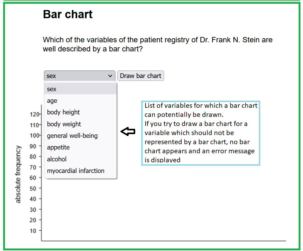
| variable name | values of the variable |
| sex | male, female |
| age | in years |
| body height | in cm |
| body weight | in kg |
| general well-being | good, moderate, bad |
| appetite | reduced, normal, increased |
| alcohol (alcohol consumption) | daily, weekly, rarely/never |
| myocardial infarction | yes, no, unclear, missing |
Use the applet to answer the following questions
-
Caution: Discrete variables with a large number of possible values should be better treated as if they were continuous. For instance, if we count the number of trees per square kilometre, then any value between \(0\) (tree-less land) and close to \(100,000\) (dense forest) may occur. Although we are dealing with discrete count data in this case, it does not make sense to illustrate them in a bar chart, as the number of bars would be huge and the data would be badly summarised.
|
Synopsis 2.3.1
Bar charts serve to illustrate discrete data with few values. |
Now Dr. Frank N. Stein would like to graphically illustrate the variable "Assessment of the resting ECG" with the abbreviation RBURTEI. The variable RBURTEI distinguishes the following categories: ` "undecided", "normal", "ischaemic origin certain", "ischaemic origin unclear" and "other anomalies".
He could of course also choose a bar chart to visualise this variable. However, as none of the categories has a very small relative frequency, the variable RBURTEI can also be illustrated in a "pie chart".
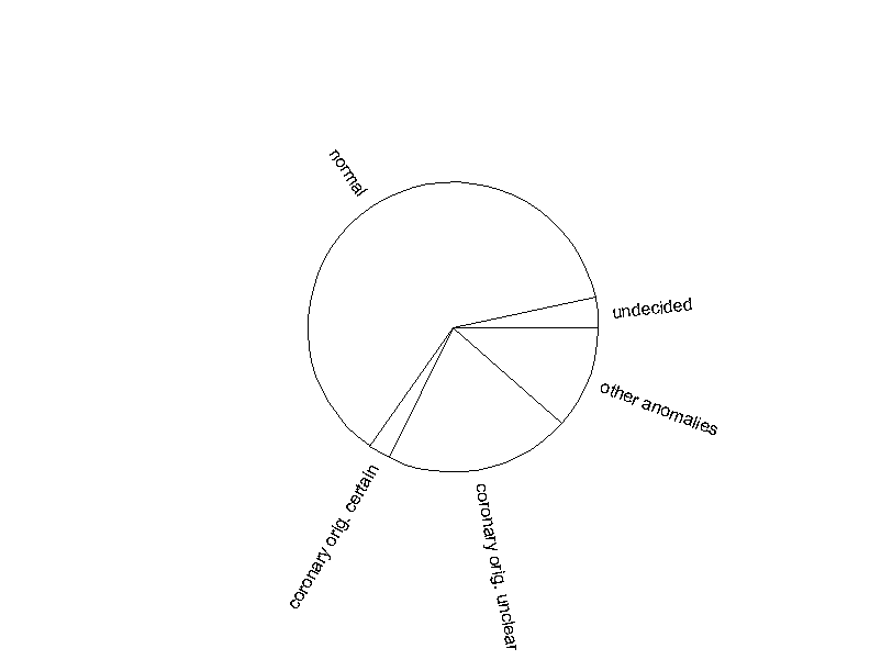
Each sector of the circle represents the relative frequency of the respective category. The total sample size and the absolute frequencies should also be indicated in this case. A pie chart is used if we want to visually compare relative frequencies. However, if some of the frequencies are similar, a bar chart may be more appropriate.
|
Synopsis 2.3.2
If a nominal variable has few categories with frequencies which are not too small, then a pie chart may be used to compare the relative frequencies of the categories. |
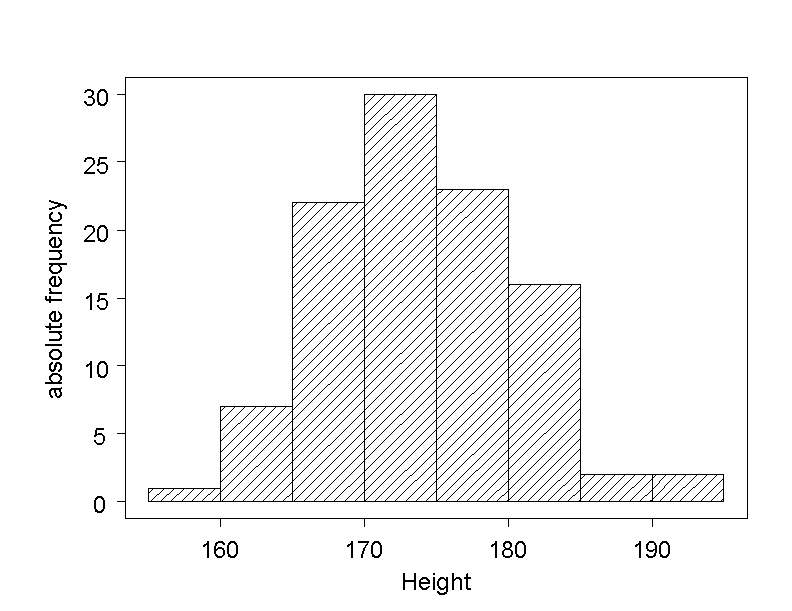
We would now like to know the frequences of the different values of age in Dr. Frank N. Stein's sample of chemical company employees. Since the variable has many values, a bar chart will not be appropriate to viusalise the frequency distribution of these values. However, the data may be divided into categories. For this, the continuous measuring scale is divided into intervals of equal width, and the number of observations falling into each of the intervals is counted. However, it is important that the number of intervals is neither too large nor too small.
There are various recommendations regarding the number of categories. A simple recommendation says that \(6\) to \(20\) intervals should be created. Hence \(5\)-year intervals are suitable for the classification of the chemical company employees' age. The respective frequencies are shown in the following table.
| Age interval (years) | Absolute frequency | Relative frequency |
|---|---|---|
| 25 - 29 | 1 | 0.008 |
| 30 - 34 | 7 | 0.058 |
| 35 - 39 | 11 | 0.091 |
| 40 - 44 | 18 | 0.149 |
| 45 - 49 | 25 | 0.207 |
| 50 - 54 | 17 | 0.140 |
| 55 - 59 | 18 | 0.149 |
| 60 - 64 | 9 | 0.074 |
| 65 - 69 | 11 | 0.091 |
| 70 - 74 | 3 | 0.025 |
| 75 - 79 | 1 | 0.008 |
The frequencies of the age categorie are now visualised in a so-called "histogram".
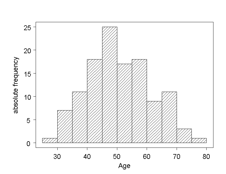
In the histogram of the variable AGE, we can see that the age of the chemical company employees in Dr. Frank N. Stein's data set ranges from \(25\) to \(79\) years. Notice that the chemical industry group also requires and pays the examination of retired employees. The highest frequency appears in the interval of \(45\) to \(49\) years, and one can roughly say that a majority of employees are between \(40\) and \(60\) years old.
The histogram resembles a bar chart. However, as there are no natural spaces between the values of a continuous variable, there are no gaps between the bars in a histogram. The base line of each bar coincides with the interval that it represents, and its height is defined by the frequency of the respective category. The absolute or the relative frequencies can be displayed in a histogram - only the scaling of the \(y\)-axis will be different. Notice that observations falling on the boundary between two intervals are assigned to the upper interval.
Caution: Histograms are mostly drawn for intervals of equal width. This is not compulsory though. However, if intervals of different length are chosen, then the areas and not the heights of the bars should be proportional to the frequencies. In this case, the \(y\)-axis represents the frequency density of values, i.e., the frequency of values in the respective interval divided by the length of the interval.
|
Synopsis 2.3.3
The histogram serves to visualise the frequency distribution of continuous variables or of quantitative discrete variables with a large number of values. |
With the help of the following applet you can test the statements of the previous question and examine various class widths and numbers of classes.

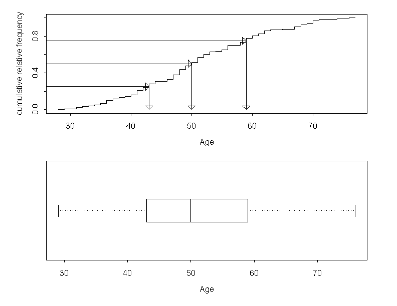
Dr. Frank N. Stein is still occupied with the illustration of the variable AGE. In addition to the histogram, he now also illustrates the variable sith its "empirical distribution function".
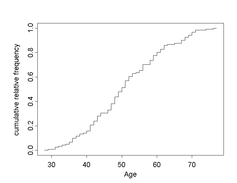
The empirical distribution function provides an answer to the question "Which proportion of observations is smaller or equal to a given value?". One such question might be: "What proportion of chemical company employees in Dr. Frank N. Stein's data set are less than or exactly \(60\) years old?".
In order to illustrate how the graph was constructed, some values are listed in the following frequency table.
| Age (yr) | abs. freq. | rel. freq. | cumulative rel. freq. |
|---|---|---|---|
| 29 (yr) | 1 | 1/121 ≈ 0.008 | 0.008 |
| 31 (yr) | 2 | 2/121 ≈ 0.017 | 0.025 |
| 32 (yr) | 1 | 1/121 ≈ 0.008 | 0.033 |
| ... | ... | ... | ... |
| 74 (yr) | 1 | 1/121 ≈ 0.008 | 0.992 |
| 76 (yr) | 1 | 1/121 ≈ 0.008 | 1.00 |
In this table, the observed values of age are represented in the column "age" in increasing order. The values in the column "absolute frequency" indicate how often the respective value of age was observed. The relative frequencies are calculated by dividing the absolute frequencies by the sample size \(121\).
The values in the column "cumulative relative frequency" are calculated as the sum of the relative frequency of the respective age and the relative frequencies of all age values below. In the case of "\(32\) years", the cumulative relative frequency is thus \(0.008 + 0.017 + 0.008 = 0.033\). This means that \(3.3\%\) of the persons in the sample were \(32\) years old or younger.
The empirical distribution function of a quantitative variable \(X\) (i.e., age in our case) is obtained by plotting the cumulative relative frequencies against the respective observed values of \(X\), and by connecting the resulting points with steps rising at the respective values \(X\). The height of each step is equal to the relative frequency of the respective value of \(X\).
Such a function is also called "step function". The empirical distribution function starts at the level \(0\) below the smallest observed value of \(X\) and ends at the level \(1\) at the largest observed value of \(X\).
If we take a look at the empirical distribution of age, we notice that the step function shows the steepest incline in the range between \(40\) and \(60\) years. This indicates that there is a concentration of employees aged between \(40\) and \(60\) years. At the right and left end, the slope declines rather rapidly, as a consequence of the few observations at the extremes.
The question asked in the beginning "How many employees of this chemical industry group are no older than \(60\) years?" can now be answered by drawing a vertical line into the graph at the age of \(60\) years. At the point where the line cuts the step function, we can read the value of the cumulative relative frequency.
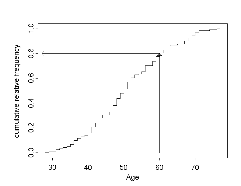
From this figure, we get a cumulative relative frequency of approximatively \(0.8\), meaning that approx. \(80\%\) of all chemical company employees are not older than \(60\) years .
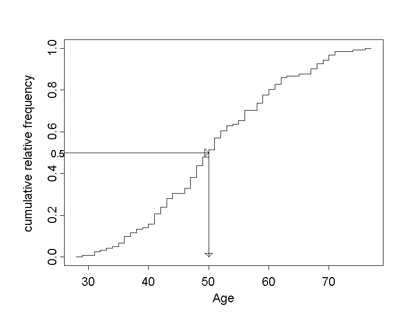
Another question might be "Until which age are you still among the younger employees?". To answer it. we first define the category of "younger employees" as the younger half of all employees, implying that \(50\%\) belong to the younger age group and the remaining \(50\%\) to the older group. Then we draw a horizontal line through the point on the \(y\)-axis with a cumulative relative frequency of \(0.5\) and determine the point where this line intersects the step function. The \(x\)-coordinate of this cutpoint is referred to as "median" (cf. next section).
of the \(121\) patients with the answer to the question
"What is the median age of the \(121\) employees?"
The \(x\)-value of this intersection point is approximately at an age of \(50\) years. From this we can conclude that approx. \(50\%\) of the chemical company employees are no older than \(50\) years. This is where the area of the histogram in figure 2.5 is cut in half. The answer to the above question is that an employee belongs to the youger half if he/she has not yet passed the age of \(50\) years.
|
Synopsis 2.3.4
The empirical distribution function provides a complete description of the frequency distribution of the values of a quantitative variable observed in a sample. |
Open the following applet and try to establish a situation where the distribution function follows roughly a straight line between the minimum and the maximum. For this, you will have to add and/or move points on the \(x\)-axis. Of course, you will never obtain an exact straight line with a finite number of points.
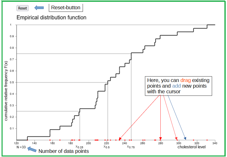
Now restore the original state of the applet and answer the following questions.
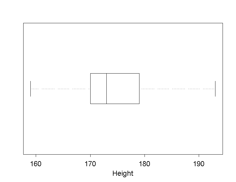
Instead of a histogram, the continuous variable AGE can also be visualised using a "boxplot".
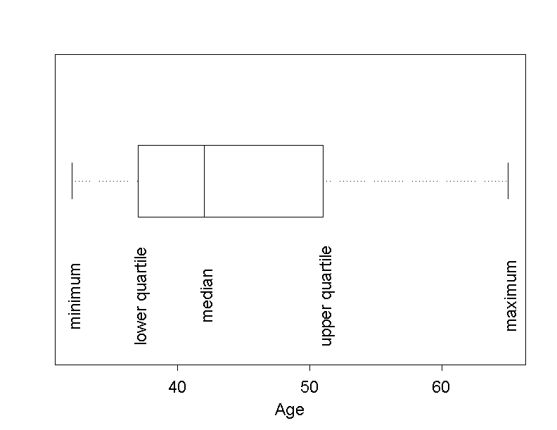
In a boxplot, the data are reduced to five statistics (or statistical measures). These statistics are
These five statistics can be derived from the empirical distribution function.
First of all we determine the lower quartile of age, i.e. the value of age, at which the cumulative relative frequency equals \(0.25\) in the empirical distribution function. Approximately \(25\%\) of the \(121\) chemical company employees have an age under this value (of approx. \(43\) years) and about \(75\%\) have an age above this value.
The median corresponds to the value of age which divides the employees into two groups of equal size. This is the value with a cumulative relative frequency of \(0.5\). We have already determined this value before.
The upper quartile is the value of age which has a cumulative relative frequency of \(0.75\). How these three statistics are determined is shown in the following figure. The minimum and the maximum are represented by the first and the last step, respectively.
The "box" of the boxplot ranges from the lower to the upper quartile. The line in the box represents the median. The central \(50\%\) of the data lie inside the box. The lower and the upper endpoint outside the box represent the minimum and the maximum of the data. A trained person can judge the location, dispersion and symmetry of the data with the help of a boxplot. You will learn more about these terms in chapter 3.
|
Synopsis 2.3.5
The boxplot serves to visualize the frequency distribution of quantitative variables with many values. |
Large amounts of data can be summarised in a compact and concise way with the help of boxplots. Boxplots are very convenient to illustrate several distributions from different samples or groups next to each other. We use this fact to compare the body height of men and women.
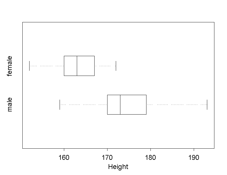
From the two boxplots it can be readily seen that a majority of women in Dr. Stein's sample are shorter than a majority of men.
In a modified boxplot, the lines outside the box, the so-called "whiskers", are only drawn up to the minimum and the maximum, if these two values lie within the so-called "fences".
The fences are defined as the two points whose distance from the box is \(1.5\) box lengths \(d\). The value of the lower fence equals \[\text{lower quartile} - 1.5 \times d ,\] and the value of the upper fence equals \[\text{upper quartile} + 1.5 \times d ,\]
If the minimum (maximum) lies outside the fences, then the respective whisker is only drawn to the lowest (highest) value within the fences, and all values lying outside the fences are represented as individual points.
As an example, the following modified boxplot illustrates the height of the \(121\) employees ( even though the two genders should be treated separately). In this plot, the lower and upper fence, as well as the box length \(d\) and the distance \(1.5 \times d\) between the fences and the box are added.
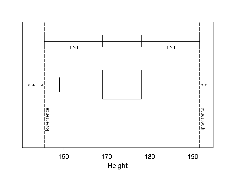
If we draw separate boxplots for men and women, only the boxplot of men shows a point outside the fences.
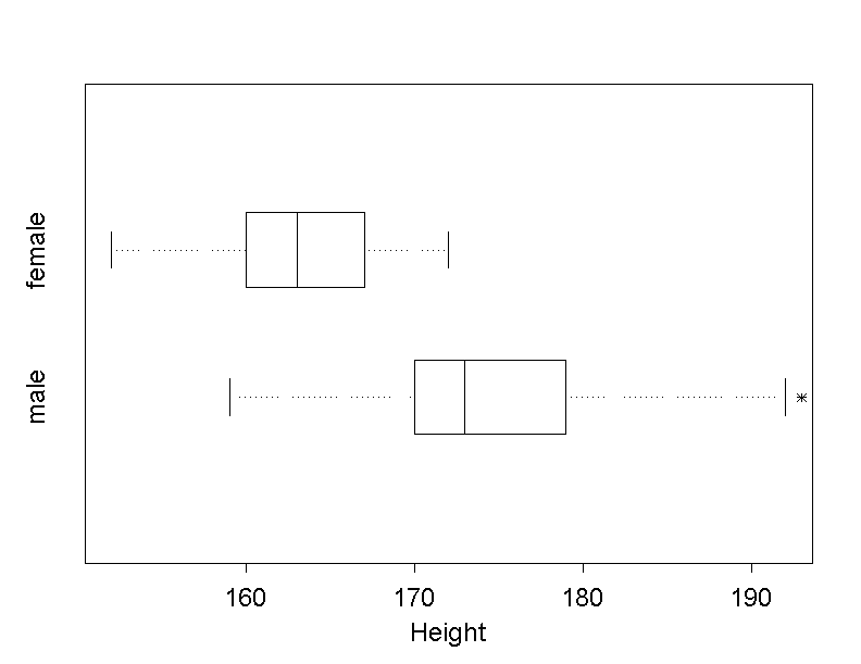
One remark to conclude: By default, most statistics programs do not display horizontal, but vertical modified boxplots.
We often hear that overweight people are more likely to have high levels of cholesterol than normal weight people. Even though a single high measurement of cholesterol in the blood has a limited significance, Dr. Frank N. Stein wants to examine this claim in the data of the chemical company employees. In order to identify a possible correlation between the weight and cholesterol level, he visualises the variables WEIGHT and CHOLEST of the \(103\) men together in a so-called "scatter plot".
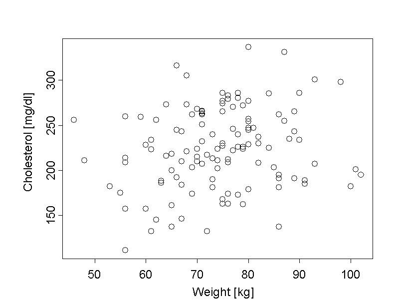
In this scatter plot, the weight of the chemical company employees is shown on the \(x\)-axis and their cholesterol values on the \(y\)-axis. This produces one point for each employee in the diagram.
If we take a look at the resulting scatter plot, we can recognise a slight trend that heavier individuals tend to have higher cholesterol levels. Whether this represents a true correlation between the two variables or just a pattern that might equally well have occurred by chance, would have to be tested formally (cf. chapter 14).
|
Synopsis 2.3.6
A scatter plot is used to visualise the jointly measured values of two continuous variables. In a scatter plot, the correlation between two variables can be observed. |
Each category of variable requires another kind of description.
Nominal data can be summarized in frequency tables, bar charts or pie charts, ordinal data in frequency tables and bar charts. The illustration in a pie chart, however, is only meaningful if the variable does not have too many values and if there are no values with a small relative frequency.
Discrete quantitative data with few values are treated like ordinal data.
The most common graphical representations of continuous quantitative data or of discrete quantitative data with many values are the histogram and the boxplot. However, such data can also be visualised by their empirical distribution function, even though this method rather serves to answer specific questions (see chapter 3) than to provide an overview of the data.
If individual values are divided into intervals, frequency tables can also be used to describe quantitative variables.
The scatter plot is used to show the correlation between two quantitative variables (while all other discussed graphs only describe single variables).